by Dee DuPuy
The first thing I do when I pick up an interesting-looking manga for a closer look is quickflip through it while squinting. If what I perceive is an undifferentiated grey blur then I put it back on the shelf. Fellow Bostonian and member of the Union Square Comics & Coffee StrikeForce, Brigid, called me out on this one day down the local comics shop:
Brigid (observing the flip stunt): Dee. Wft?
Dee (putting the book back): Over-toned.
Brigid: What does that MEAN?
Dee: Hmpfh. Reviewer.
Brigid: Yeah? Well why don’t you write us up some enlightenment then?
Dee (not realizing it was going to take her 2 freakin days to compose this…): HAH. NO PROBLEMO.
I don’t pretend to be an authority on toning— everything I know I learned on the job: from my first webcomic in 2003 to toning Svetlana Chmakova’s Dramacon series for Tokyopop beginning in 2005, to her new work, Nightschool to debut in July in Yen Press’ Yen Plus. In the years she and I have worked together, though, we’ve learned a lot— reading, researching and experimenting with different techniques, trying new things, and studying the work of the masters. This is a quick trip through what we’ve learned for those who might have wondered what the heck toning is (like all my non-artist friends. And my mom.) and how it contributes to the beauty and diversity of the comic form.
What is toning?
Toning is the process of shading lineart to provide "color", texture and contrast, to bring clarity to the page by enhancing a sense of 3-dimensionality and to add interest and emotion to the art.
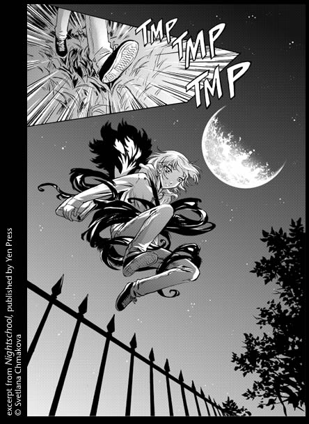
These inks are from chapter 2 of Svet’s new series. They look fantastic just as they are…
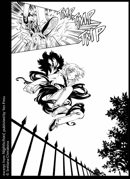
But this is Nightschool. What the toner does is provide the night. ^^
What is tone, anyway?
Tone is short for ‘screentone’ which was originally a roughly 10 x 14" sheet of sticky plastic film upon which various patterns are printed in black.
Applying tone by hand traditionally requires a distressing array of tools including various knives and cutters for cutting the tone to fit the linework, a suite of burnishers for adhering the tone to the paper, tape for when the tone comes loose again, different types of erasers for creating various effects and cleaning up, dusters that look like bird’s wings, thick white paint for highlights, and the kind of endless patience you’d normally associate with something dead— like a clam, maybe, or a brick. Also money to spend on either therapy or assistants to help you with this mind-bogglingly exacting task, and maybe chemo because I’ve read that the tiny shards of film that end up everywhere after you’ve toned a book or two are, in fact, carcinogenic.
In recent years we’ve seen the introduction of software specifically created to do comics— including toning— like ComicWorks and MangaStudio, though intrepid digital explorers have been both scanning analog tones into and creating their own tones in Photoshop long before these products jumped the Pacific.
I tone digitally. I use both of the apps above but my workhorse is Comicworks. There are 800 tones in Comicworks v.2 Max— Deleter’s entire tone catalog— including a dizzying collection of shoujo sparkle-dust tones ALL of which were used for Dramacon. ^^
Sometimes I go tone-hunting and try one I’ve never used before (SE-737: SPINNING LINEOLEM FLOOR DEATH VORTEX). But mainly you stick with the basics— dot tones, sands and gradients.
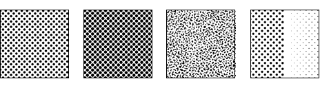
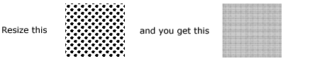
This is what tones look like, zoomed in, approximately. I say approximately because to show you these things on the web they’ve been greyscaled and reduced. Tones are bitmaps— black and white only— which is why they print cleanly. But also why they don’t work well at low resolutions or if they’ve been resized.
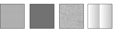
When printed, the same tones will look kinda like this. Black dots at high resolutions are perceived as grey (600dpi is optimal for toned work, though I have heard some publishers require creators to submit stupid-big 1200dpi files, presumably so they can later take the same art and plaster it across a bus or something, I dunno…) and voilà! shading that reproduces well.
What is good toning?
Digital toning has some distinct advantages over toning by hand. It’s far faster and easier to apply tones digitally. There’s undo. And it’s also just a lot cheaper— a sheet of tone will set you back somewhat over two bucks in the US, and you are using bits and pieces of many many tone sheets per page.
That said, there’s a beauty about analog tones and the various techniques that have evolved over the years for applying, enhancing and altering them that can be lost when the whole process goes digital. Most creators I know have spent at least a little time taping up X-acto knife wounds after going a few rounds with a box of Deleter Jrs., and that’s a good thing. There’s a feel to toning by hand— an aesthetic— that good digital toners understand and try to honor.
Toning is not painting. Good tonework compliments and enhances the beauty of the linework, it does its part to make the action clear, to move the eye across the page as the story unfolds. It doesn’t attempt to draw attention to itself — it’s a teamplayer. As toning grew into the art that it is originally in Japan, some have speculated that there’s some sort of underlying Japanese aesthetic sense that drives the feel of good tonework. It could be some zen thing, yeah, but mainly, I think, artists are poor, tones are expensive and they’re a bitch to apply besides, so good toning is characterized by restraint and good judgment. You tone what needs to be toned and give the linework some space to breathe. Knowing how to tone means knowing when not to.
Svet and I draw our inspiration from the rich tradition of analog tone technique while attempting a few unique twists of our own. You can see some of those techniques here, done digitally:
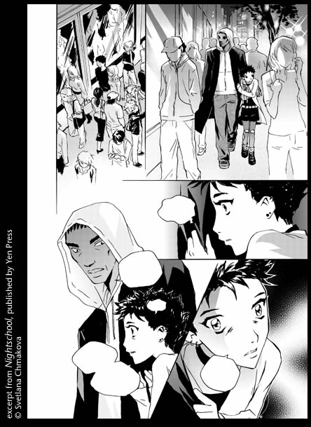
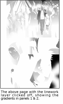
in panel 2 Daemon and Marina are walking down a busy NYC street at night. In both panel 1 and 2 there is only one gradient covering the entire panel. That economy is directly out of the analog toning tradition. The highlights on the anonymous crowd are "cut" out of the gradient tone along with the shines of the city lights, while the balls of streetlight and the reflections in the windows are "rubbed" out of the tone in a technique that simulates rubbing at the tone with a sand eraser.
 In reality, digitally, you could toss as many gradients as you wanted to in there. And the "rubbing" is done with an airbrush tool (with my special customized curve and a LOT of practice) and the eraser tool. And the highlights are just painted on top, though you see how the strokes are a little rough? That’s to convey the spirit of having to cut the tone with a knife.
There’s no need to get religious about it, but keeping in mind the way it’s done by hand counteracts the tendency to add too much complexity and forces you to consider before you just slab on something else because it’s easy. Good toning is all about restraint— use just as much as you need, no more.
In panel 5 tone SE-1079: Dark Enchantment— a tone we use elsewhere for magic effects— is here shifted so the sparkly bits are hidden and we only see the smoky, cloudy part of the tone. The placement both pops Marina out of the background and expresses the deep anxiety of her mood. Forcing a tone to serve as many purposes as possible— technical, graphical, emotional— is economical. A good use of tone.
Tones don’t really have names, btw. But when you’re working with hundreds of them over the course of years via long distance they tend to acquire them. This is a brief glimpse at the Dee/Svet Evolved MasterList Vocabulary of ToneSpeak (omg, we are such freakin geeks ^_^;;;) …
- SE-1079: Dark Enchantment
- SE-293: Uneasy Miasma
- SE-221: Demented Dots
- "Happy Fun Tone, Dee’s Choice" is ALWAYS SE-384: Pi’s & Chicks except that NEVER works T_T so usually ends up being SE-350-2: Silly Squid or SE-352: Go Go Godzilla
- SE-158: Matt’s Coat and
- 80L at 15%: Christie’s Hair, which lives on as Daemon’s skintone.
And SE-737: Spinning Linoleum Floor Death Vortex? It looks like this:
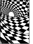
… I’ve still never found a place to use it.
One last thing, I get asked this a lot…
Why do mangaka love plaid so much?
Tones work brilliantly for what they’re designed to do and fail spectacularly when you take them out of their comfort zone, which is a fairly narrow band.
Moiré is an interference pattern created when you take regular patterns, like the dots below, and mess them around— by overlapping them at different line counts, by rotating them and by resizing them after they’ve been applied. Tones are applied last, at the actual size at which the work is to be printed. There are ways to go around those restrictions but they’re compromises at best.
The plaid means that someone— not the artist, because anyone who’s being printed at that level is well aware of how to use tones— but SOMEone has mishandled those files on their journey into print. And you should write a righteous letter of indignation to the publisher to complain. ^^